Eggcellent News Against Dementia?
10almonds is reader-supported. We may, at no cost to you, receive a portion of sales if you purchase a product through a link in this article.
It’s that time of the week again… We hope all our readers have had a great and healthy week! Here are some selections from health news from around the world:
Moderation remains key
Eggs have come under the spotlight for their protective potential against dementia, largely due to their content of omega-3 fatty acids, choline, and other nutrients.
Nevertheless, the study had some limitations (including not measuring the quantity of eggs consumed, just the frequency), and while eating eggs daily showed the lowest rates of dementia, not eating them at all did not significantly alter the risk.
Eating more than 2 eggs per day is still not recommended, however, for reasons of increasing the risk of other health issues, such as heart disease.
Read in full: Could eating eggs prevent dementia?
Related: Eggs: Nutritional Powerhouse or Heart-Health Timebomb?
More than suitable
It’s common for a lot of things to come with the warning “not suitable for those who are pregnant or nursing”, with such frequency that it can be hard to know what one can safely do/take while pregnant or nursing.
In the case of COVID vaccines, though, nearly 90% of babies who had to be hospitalized with COVID-19 had mothers who didn’t get the vaccine while they were pregnant.
And as for how common that is: babies too young to be vaccinated (so, under 6 months) had the highest covid hospitalization rate of any age group except people over 75.
Read in full: Here’s why getting a covid shot during pregnancy is important
Related: The Truth About Vaccines
Positive dieting
Adding things into one’s diet is a lot more fun than taking things out, is generally easier to sustain, and (as a general rule of thumb; there are exceptions of course) give the greatest differences in health outcomes.
This is perhaps most true of beans and pulses, which add many valuable vitamins, minerals, protein, and perhaps most importantly of all (single biggest factor in reducing heart disease risk), fiber.
Read in full: Adding beans and pulses can lead to improved shortfall nutrient intakes and a higher diet quality in American adults
Related: Intuitive Eating Might Not Be What You Think
Clearing out disordered thinking
Hoarding is largely driven by fear of loss, and this radical therapy tackles that at the root, by such means as rehearsing alternative outcomes of discarding through imagery rescripting, and examining the barriers to throwing things away—to break down those barriers one at a time.
Read in full: Hoarding disorder: sensory CBT treatment strategy shows promise
Related: When You Know What You “Should” Do (But Knowing Isn’t The Problem)
Superfluous
Fluoridated water may not be as helpful for the teeth as it used to be prior to about 1975. Not because it became any less effective per se, but because of the modern prevalence of fluoride-containing toothpastes, mouthwashes, etc rendering it redundant in more recent decades.
Read in full: Dental health benefits of fluoride in water may have declined, study finds
Related: Water Fluoridation, Atheroma, & More
Off-label?
With rising costs of living including rising healthcare costs, and increasing barriers to accessing in-person healthcare, it’s little wonder that many are turning to the gray market online to get their medications.
These websites typically use legal loopholes to sell prescription drugs to the public, by employing morally flexible doctors who are content to expediently rubber-stamp prescriptions upon request, on the basis of the patient having filled out a web form and checked boxes for their symptoms (and of course also having waived all rights of complaint or legal recourse).
However, some less scrupulous sorts are exploiting this market, to sell outright fake medications, using a setup that looks like a “legitimate” gray market website. Caveat emptor indeed.
Read in full: CDC warns of fake drug dangers from online pharmacies
Related: Are You Taking PIMs? Getting Off The Overmedication Train
A rising threat
In 2021 (we promise the paper was published only a few days ago!), the leading causes of death were:
- COVID-19
- Heart disease
- Stroke
…which latter represented a rising threat, likely in part due to the increase in the aging population.
Read in full: Stroke remains a leading cause of death globally, with increased risk linked to lifestyle factors
Related: 6 Signs Of Stroke (One Month In Advance)
Take care!
Don’t Forget…
Did you arrive here from our newsletter? Don’t forget to return to the email to continue learning!
Recommended
Learn to Age Gracefully
Join the 98k+ American women taking control of their health & aging with our 100% free (and fun!) daily emails:
-
What Mattress Is Best, By Science?
10almonds is reader-supported. We may, at no cost to you, receive a portion of sales if you purchase a product through a link in this article.
The Foundations of Good Sleep
You probably know the importance of good sleep for good health. If not, here’s a quick refresher:
- Why You Probably Need More Sleep
- How Sleep-Deprived Are You, Really?
- The 6 Dimensions Of Sleep (And Why They Matter)
You should also definitely check out this quite famous book on the topic:
Why We Sleep – by Dr Matthew Walker
What helps, to get that good sleep
We’ve covered this a little before too, for example:
- Safe Effective Sleep Aids For Seniors
- Sleep Better With Better Air
- How To Nap Like A Pro (No More “Sleep Hangovers”!)
How to level-up from there
One of the biggest barriers to good sleep for many people is obstructive sleep apea:
Healthier, Natural Sleep Without Obstruction!
We covered (in the above article) a whole lot of ways of mitigating/managing obstructive sleep apnea. One of the things we mentioned as beneficial was avoiding sleeping on one’s back, and this is something Mayo Clinic’s Dr. Somers agreed with:
Back Sleeping, And Sleeping Differently After 50
“But side-sleeping is uncomfortable”
If this is you, then chances are you have the wrong mattress.
If your mattress is too firm, you can get around it by using this “five pillow” method:
Click Here If The Embedded Video Doesn’t Load Automatically
If your mattress is too soft, then sorry, you really just have to throw that thing out and start again.
The Goldilocks mattress
While different people will have different subjective preferences, the science is quite clear on what is actually best for people’s spines. As this review of 39 qualified scholarly articles concluded:
❝Results of this systematic review show that a medium-firm mattress promotes comfort, sleep quality and rachis alignment❞
~ Dr. Gianfilippo Caggiari et al.
Read in full: What type of mattress should be chosen to avoid back pain and improve sleep quality? Review of the literature
Note: to achieve “medium-firm” that remains “medium firm” has generally been assumed to require a memory-foam mattress.
How memory-foam works: memory-foam is a moderately thermosoftening material, designed to slightly soften at the touch of human body temperature, and be firmer at room temperature. This will result in it molding itself to the form of a human body, providing what amounts to personalized support for your personal shape and size, meaning your spine can stay exactly as it’s supposed to when you’re sleeping on your side, instead of (for example) your hips being wider meaning that your lumbar vertebrae are raised higher than your thoracic vertebrae, giving you the equivalent of a special nocturnal scoliosis.
It will, therefore, stop working if
- the ambient temperature is comparable to human body temperature (as happens in some places sometimes, and increasingly often these days)
- you die, and thus lose your body temperature (but in that case, your spinal alignment will be the least of your concerns)
Here’s a good explanation of the mechanics of memory foam from the Sleep Foundation:
Sleep Foundation | What is Memory Foam?
An alternative to memory foam?
If you don’t like memory foam (one criticism is that it doesn’t allow good ventilation underneath the body), there is an alterative, the grid mattress.
It’s very much “the new kid on the block” and the science is young for this, but for example this recent (April 2024) study that concluded:
❝The grid mattress is a simple, noninvasive, and nonpharmacological intervention that improved adults sleep quality and health. Controlled trials are encouraged to examine the effects of this mattress in a variety of populations and environments.❞
~ Dr. Heather Hausenblas et al.
Read in full: Effectiveness of a grid mattress on adults’ sleep quality and health: A quasi-experimental intervention study
However, that was a small (n=39) uncontrolled (i.e. there was no control group) study, and the conflict of interest statement is, well, interesting:
❝Heather A. Hausenblas, Stephanie L. Hooper, Martin Barragan, and Tarah Lynch declare no conflict of interest. Michael Breus served as a former consultant for Purple, LLC.❞
~ Ibid.
…which is a fabulous way of distracting from the mention in the “Acknowledgements” section to follow, that…
❝Purple, LLC, provided financial support for the study❞
~ Ibid.
Purple is the company that invented the mattress being tested. So while this doesn’t mean the study is necessarily dishonest and/or corrupt, it does at the very least raise a red flag for a potential instance of publication bias (because Purple may have funded multiple studies and then pulled funding of the ones that weren’t going their way).
If you are interested in Purple’s mattress and how it works, you can check it out here ← this is a link for your interest and information; not an advertisement or an endorsement. We look forward to seeing more science for this though, and echo their own call for randomized controlled trials!
Summary
Sleep is important, and while it’s a popular myth that we need less as we get older, the truth is that we merely get less on average, while still needing the same amount.
A medium-firm memory-foam mattress is a very good, well-evidenced way to support that (both figuratively and literally!).
A grid mattress is an interesting innovation, and/but we’d like to see more science for it.
Take care!
Share This Post
-
Black Pepper’s Impressive Anti-Cancer Arsenal
10almonds is reader-supported. We may, at no cost to you, receive a portion of sales if you purchase a product through a link in this article.
Black Pepper’s Impressive Anti-Cancer Arsenal (And More)
Piperine, a compound found in Piper nigrum (black pepper, to its friends), has many health benefits. It’s included as a minor ingredient in some other supplements, because it boosts bioavailability. In its form as a kitchen spice, it’s definitely a superfood.
What does it do?
First, three things that generally go together:
These things often go together for the simple reason that oxidative stress, inflammation, and cancer often go together. In each case, it’s a matter of cellular wear-and-tear, and what can mitigate that.
For what it’s worth, there’s generally a fourth pillar: anti-aging. This is again for the same reason. That said, black pepper hasn’t (so far as we could find) been studied specifically for its anti-aging properties, so we can’t cite that here as an evidence-based claim.
Nevertheless, it’s a reasonable inference that something that fights oxidation, inflammation, and cancer, will often also slow aging.
Special note on the anti-cancer properties
We noticed two very interesting things while researching piperine’s anti-cancer properties. It’s not just that it reduces cancer risk and slows tumor growth in extant cancers (as we might expect from the above-discussed properties). Let’s spotlight some studies:
It is selectively cytotoxic (that’s a good thing)
Piperine was found to be selectively cytotoxic to cancerous cells, while not being cytotoxic to non-cancerous cells. To this end, it’s a very promising cancer-sniper:
Piperine as a Potential Anti-cancer Agent: A Review on Preclinical Studies
It can reverse multi-drug resistance in cancer cells
P-glycoprotein, found in our body, is a drug-transporter that is known for “washing out” chemotherapeutic drugs from cancer cells. To date, no drug has been approved to inhibit P-glycoprotein, but piperine has been found to do the job:
Targeting P-glycoprotein: Investigation of piperine analogs for overcoming drug resistance in cancer
What’s this about piperine analogs, though? Basically the researchers found a way to “tweak” piperine to make it even more effective. They called this tweaked version “Pip1”, because calling it by its chemical name,
((2E,4E)-5-(benzo[d][1,3]dioxol-5-yl)-1-(6,7-dimethoxy-3,4-dihydroisoquinolin-2(1 H)-yl)penta-2,4-dien-1-one)
…got a bit unwieldy.
The upshot is: Pip1 is better, but piperine itself is also good.
Other benefits
Piperine does have other benefits too, but the above is what we were most excited to talk about today. Its other benefits include:
- Neuroprotective effects (against Alzheimer’s, Parkinson’s, and more)
- Blood-sugar balancing / antidiabetic effect
- Good for gut microbiome diversity
- Heart health benefits, including cholesterol-balancing
- Boosts bioavailability of other nutrients/drugs
Enjoy!
Share This Post
-
Peas vs Green Beans – Which is Healthier?
10almonds is reader-supported. We may, at no cost to you, receive a portion of sales if you purchase a product through a link in this article.
Our Verdict
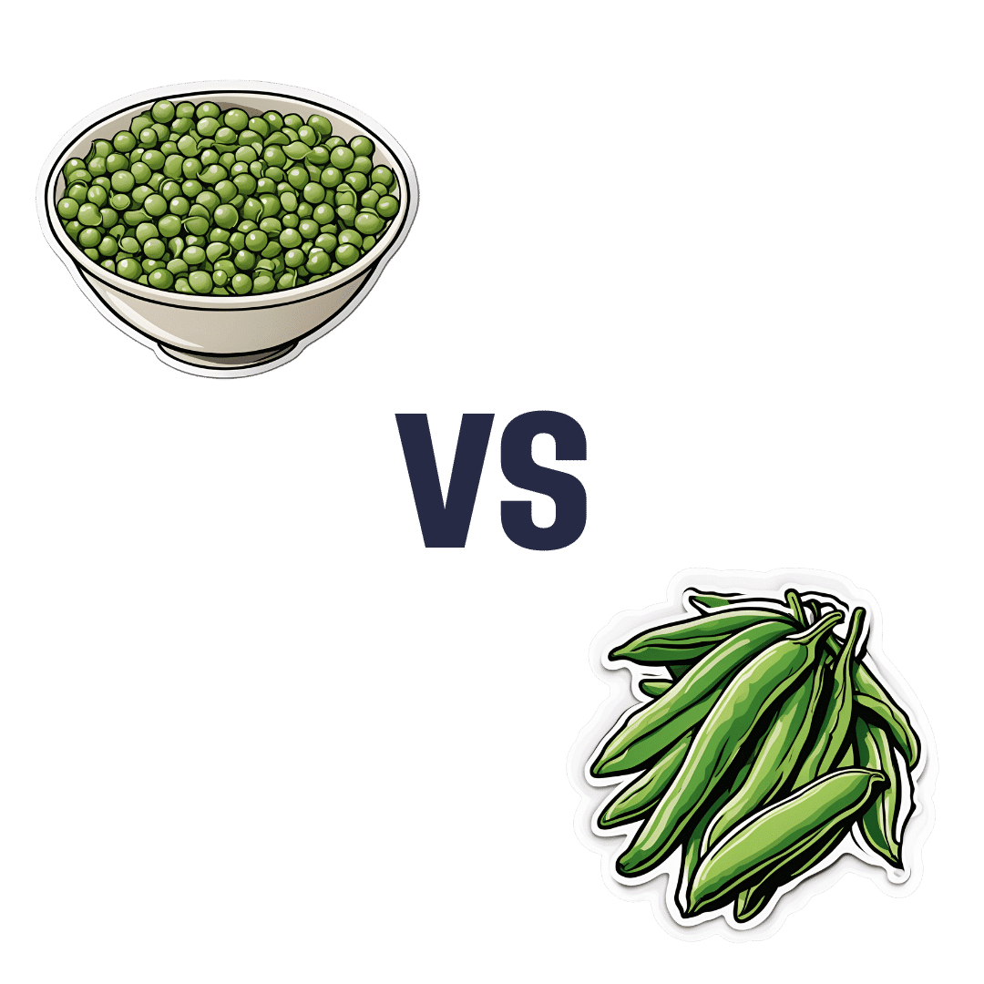
When comparing peas to green beans, we picked the peas.
Why?
Looking at macros first, peas have nearly 6x the protein, nearly 2x the fiber, and nearly 2x the carbs, making them the “more food per food” choice.
In terms of vitamins, peas have more of vitamins A, B1, B2, B3, B5, B6, B7, B9, C, and choline, while green beans have more of vitamins E and K. An easy win for peas.
In the category of minerals, peas have more copper, iron, magnesium, manganese, phosphorus, potassium, selenium, and zinc, while green beans have more calcium. Another overwhelming win for peas.
In short, enjoy both (diversity is good), but there’s a clear winner here and it’s peas.
Want to learn more?
You might like to read:
Peas vs Broad Beans – Which is Healthier?
Take care!
Share This Post
Related Posts
-
10 “Healthy” Foods That Are Often Worse Than You Think
10almonds is reader-supported. We may, at no cost to you, receive a portion of sales if you purchase a product through a link in this article.
“This is healthy, it’s a…” is an easy mistake to make if one doesn’t read the labels. Here are 10 tricksters to watch out for in particular!
Don’t be fooled by healthy aesthetics on the packaging…
Notwithstanding appearances and in many cases reputations, these all merit extra attention:
- Yogurt: sweetened yogurts, especially “fruit at the bottom / in the corner” types, often have 15–30g of sugar per serving. Plain Greek yogurt is a better choice, offering 15–20g of protein with no added sugar. You can always add fresh fruits or spices like sweet cinnamon for flavor without added sugar.
- Oatmeal: prepackaged oatmeal can contain 12–15 grams of added sugar per serving, similar to a glazed donut. Additionally, finely milled oats (as in “instant” oatmeal) can cause blood sugar spikes by itself, due to the loss of fiber. Better is plain oats, and if you like, you can sweeten them naturally with sweet cinnamon and/or fresh fruit for a healthier breakfast.
- Sushi: while sushi contains nutritious fish, it often has too much white rice (and in the US, sushi rice is also often cooked with sugar to “improve” the taste and help cohesion) and sugary sauces. This makes many rolls much less healthy. So if fish (the sashimi component of sushi) is your thing, then focus on that, and minimize sugar intake for a more balanced meal.
- Baked beans: store-bought baked beans can have up to 25g of added sugar per cup, similar to soda. Better to opt for plain beans and prepare them at home so that nothing is in them except what you personally put there.
- Deli meats: deli meats are convenient but often are more processed than they look, containing preservatives linked to health risks. Fresh, unprocessed meats like chicken or turkey breast are healthier and can still be cost-effective when bought in bulk.
- Fruit juices: fruit juices lack fiber (meaning their own natural sugars also become harmful, with no fiber to slow them down) and often contain added sugars too. Eating whole fruits is a much better way to get fiber, nutrients, and controlled healthy sugar intake.
- Hazelnut spread: hazelnut spreads are usually 50% added sugar and contain unhealthy oils like palm oil. So, skip those, and enjoy natural nut butters for healthier fats and proteins.
- Granola: granola is often loaded with added sugars and preservatives, so watch out for those.
- Sports drinks: sports drinks, with 20–25g of added sugar per serving, are unnecessary and unhelpful (except, perhaps, in case of emergency for correcting diabetic hypoglycemia). Stick to water or electrolyte drinks—and even in the latter case, check the labels for added sugar and excessive sodium!
- Dark chocolate: dark chocolate with 80% or more cocoa has health benefits but still typically contains a lot of added sugar. Check labels carefully!
For more on each of these, enjoy:
Click Here If The Embedded Video Doesn’t Load Automatically!
Want to learn more?
You might also like to read:
From Apples to Bees, and High-Fructose Cs: Which Sugars Are Healthier, And Which Are Just The Same?
Take care!
Don’t Forget…
Did you arrive here from our newsletter? Don’t forget to return to the email to continue learning!
Learn to Age Gracefully
Join the 98k+ American women taking control of their health & aging with our 100% free (and fun!) daily emails:
-
Testosterone, Tourette’s, and Tickly Throats
10almonds is reader-supported. We may, at no cost to you, receive a portion of sales if you purchase a product through a link in this article.
It’s Q&A Day at 10almonds!
Have a question or a request? You can always hit “reply” to any of our emails, or use the feedback widget at the bottom!
In cases where we’ve already covered something, we might link to what we wrote before, but will always be happy to revisit any of our topics again in the future too—there’s always more to say!
As ever: if the question/request can be answered briefly, we’ll do it here in our Q&A Thursday edition. If not, we’ll make a main feature of it shortly afterwards!
So, no question/request too big or small
❝Could you do a series on mens health? Testosterone boosters. Libido? What works what doesnt? Also could you discuss prostate health and what supplements, meds, foods or protocols work to relieve symptoms of bph❞
We could indeed! We’ll be sure to write more, but while you’re waiting, you might like to read our main feature from a while back:
Too Much Or Too Little Testosterone?
…as it does include a lot about the use of a supplement that helps against Benign Prostatic Hyperplasia, with performance comparable to the most common drug prescribed for such.
And since (like that drug) it’s a 5α-reductase inhibitor (meaning it works by blocking the conversion of testosterone to DHT), this means it helps against prostate problems (and also, incidentally, male pattern hair loss) without reducing overall testosterone levels. In fact, because less testosterone will be converted to DHT, you’ll actually (all other things being equal) end up with slightly higher free testosterone levels.
❝My BMI is fine, but my waist is too big. What do I do about that? I am 5′ 5″ tall and 128 pounds and 72 years old.❞
It’s hard to say without knowing about your lifestyle (and hormones, for that matter)! But, extra weight around the middle in particular is often correlated with high levels of cortisol, so you might find this of benefit:
Lower Your Cortisol! (Here’s Why & How)
❝Is there anything special that might help someone with Tourette’s syndrome?❞
There are of course a lot of different manifestations of Tourette’s syndrome, and some people’s tics may be far more problematic to themselves and/or others, while some may be quite mild and just something to work around.
It’s an interesting topic for sure, so we’ll perhaps do a main feature (probably also covering the related-and-sometimes-overlapping OCD umbrella rather than making it hyperspecific to Tourette’s), but meanwhile, you might consider some of these options:
- Deep Brain Stimulation (DBS)
- Medications/ Pharmacology
- Comprehensive Behavioral Intervention for Tics (CBIT)
- Speech Therapies
❝Natural solutions for osteoarthritis. Eg. Rosehip tea, dandelion root tea. Any others??? What foods should I absolutely leave alone?❞
We’ll do a main feature on arthritis (in both its main forms) someday soon, but meanwhile, we recommend eating for good bone/joint health and against inflammation. To that end, you might like these main features we did on those topics:
- We Are Such Stuff As Fish Are Made Of (collagen for bone and joint health)
- The Bare-Bones Truth About Osteoporosis (eating for bone health generally)
- Keep Inflammation At Bay (dietary tips for minimizing inflammation—also, our all-time most popular article to date!)
Of these, probably the last one is the most critical, and also will have the speediest effects if implemented.
We turn the tables and ask you a question!
We’ll then talk about this tomorrow:
Don’t Forget…
Did you arrive here from our newsletter? Don’t forget to return to the email to continue learning!
Learn to Age Gracefully
Join the 98k+ American women taking control of their health & aging with our 100% free (and fun!) daily emails:
-
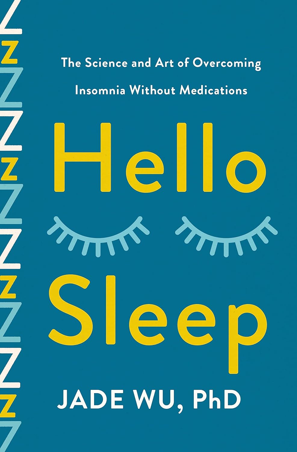
Hello Sleep – by Dr. Jade Wu
10almonds is reader-supported. We may, at no cost to you, receive a portion of sales if you purchase a product through a link in this article.
We’ve reviewed other sleep books before, so what makes this one stand out?
Mostly, it’s because this one takes quite a different approach.
While still giving a nod to the sensible advice you’ve already read in many places (including here at 10almonds), Dr. Wu looks to help the reader avoid falling into the trap (or: help the reader get out of the trap, if already there) of focussing so much on getting better sleep that it becomes an all-consuming stressor that takes up much of the day thinking about it, and guess what, much of the night too, because you’re busy working out how sleep-deprived you’re going to be tomorrow.
Instead, Dr. Wu recommends to work with your body rather than against it, worry less, and ultimately sleep better. Of course, the “how” of this is what makes most of the book.
She does also give chapters on things that may be different for you, based on such things as hormones, age, or medical conditions.
The writing style is pop-science but with frequent references to scientific papers as appropriate, making good science very accessible.
Bottom line: if you’ve tried everything else and/but good sleep still eludes you, this book will help you to end the battle and make friends with your sleep (a metaphor the author uses throughout the book, by the way).
Click here to check out Hello Sleep, and indeed get better sleep!
Don’t Forget…
Did you arrive here from our newsletter? Don’t forget to return to the email to continue learning!
Learn to Age Gracefully
Join the 98k+ American women taking control of their health & aging with our 100% free (and fun!) daily emails:


